Monday, November 06, 2006
About Me

- Name: Digital Scott's Illustrationblog
- Location: Ventura, California, United States
I am an illustrator and graphic designer. I design and build web sites. I am a volunteer naturalist and spend time whale watching. I don't wear glasses. I don't have short hair. I hate wearing ties. And I'm not that good looking.


46 Comments:
Great illo, scott....very nice rendering! great work.
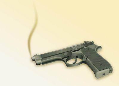
I really like the Freehand version. My favorite part is where the end of the barrel is joining with the muzzle. The gradient from charcoal-gray to silver-gray, with the beveled edge is super. As a bonus this “piece” reminds of Megatron!
it is a great draw... get it? draw! no honestly,it is so real, it is scary!
the PS takes it to ahigher level nice work
Great technical skill! It really shows in the details. Nice work.
Looks real enough but have you tried flushing the toilet? Ha Ha Ha Only you will be laughing! DZ
practice makes perfect, and this looks just about perfect to me.
thanks for all the nice words you leave on my blog:)
Very, very realistic! I like the second one cuz it looks more real! Thanks for stopping by my blog btw. You are so lucky to have a dog!
I like the top version. Very nice.
I loved the first version! It's a great illo! Congratulations and thank for visit my blog!
hey i appreciate the comment love. amazing work here, the bottom gun looks like something straight out of Xbox 360 graphics. keep it up californ
great work.. really detailed it looks real
Great detail and perspective. Perfect job!
wow, you have such a variety of work. Great you can do the technical stuff, and collage and everything. I admire that.
Nice work! I like the simple waft of smoke, nicely understated.
Thanks for your comments on my work. It feels nice to get my feet wet again!
this must've been really fiddly to do... nice work!
A clever interpretation of the word. I like your clean and graphic style.
very nice work
Great work, i like with outlines.
Thank you for your visit and commentaries.
So realistic, I can smell the cordite!
wow! wonderfuL!
very cool!
Nice illustration, I'd love to be able to do something so detailed in Freehand. Thanks for your kind comments on my doodle.
i like the top version, nice outline.
One thing I've never mastered is drawing through a computer program, weather it's photoshop, illustrator, freehand or the like. You've done a very nice job. I could see it on the page of a comic book!
That's very realistic. Great three-dimensional effect.
Very, very nice...
both versions have a totally different feel
Wow, awesome work! They're both distinct in style and feeling.
clever and very well done!
very coool rendering!
wow, you are really excellent in FreeHand, really impressive ! and the final touch makes it really powerful !! great work ;)
Well done! I like the first one best, the PhotoShop and you did a great job!
greetings - georg
Wow. Very technical! Great concept. I checked out your website-another impressive collection of work. I wish I had the patience for such detail. Thanks for checking out my illo too.
The smoking gun... I am in awe of your technical illustration expertise. They're both great, but I really like the unaltered Freehand version.
Although most people say they like the unaltered Freehand version (the bottom one right?) I like the one with lines. It gives it its own style reminiscent of comic books. It makes it more interesting. But then again, I'm a sucker for line. I've never tried Freehand...is it anything like Illustrator? the style in the bottom piece looks like it was created in Illustrator.
Wow! Very clean illustration. You are definitely mixing it up. Keep up all the fun stuff.
wow looks amazing!. So real!great work :)
Super idea and the fresh clean precision of your freehand work with this subject is a beautiful thing. Wow!
wow cool work man
Wow! That's a very detailed illustration! Great work!
great work scott!
sorry for the delayed reply, nanowrimo has had me extremely occupied.
very good illustrations ! they both look great but i think my favorite is the freehand version
awesome work! Freehand owns Illustrator.
ooo! Very nice angle, and awesome idea for the I.F.
Hi! Thank you so much for asking after me! It's been so long since I've posted and made the rounds. Shame on me! Your latest work is just out of this world! You should be so proud! Pearls before Swine...and more absolutely blew me away! Looking forward to seeing what's next! I'll keep up this time! :) I hope to have my new IF submission up tomorrow!
Great work Scott! I really like this. 'Course I've always had a "thing" for guns, knives, firecrackers and cherry bombs. Will I ever grow up?
Robert
Post a Comment
<< Home