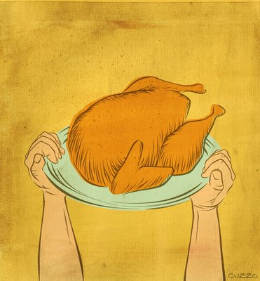
Illustration Friday-Thanksgiving

Click image for a larger view.
This is my entry for Illustration Friday's "Thanksgiving" topic. Done today, Friday, specifically for the challenge.
I decided on a style that I wanted to try. Thought of a simple composition, then I photographed my hands holding up a platter for reference. I then drew all the lines in Freehand. Brought the vector art into Photoshop where I added color. I painted a background and scanned that in. I also scanned a couple other organic textures and blended those in.
What do you think?


34 Comments:
Very Cool, really dig the colors and hands. Nicely done. Check out mine for today too at http://www.flickr.com/photos/confabulance/299542750/
really good!
This looks nice. I like your line work and the mixture of digital with some texture and stuff by hand. You should work some more in this style and see where it takes you.
i really like where you are going with this technique. the varied line weight is working. nice work.
Long live the turkey! :-) Nice one.
This is definitelty a great style that I think you should explore further. Nice job.
Great composition and style. Simplicity says it all. Very nice!
Great style...It came out looking a bit vintage, especially with that color palette. Nice job!
Super job & great color choices!
I think this is awesome Scott! It looks just like a serigraph! Very cool the way you have the image slightly outside the registration, the simplicity of the lines and colours are deadon perfect! Love this!
Like this style a lot! Very well done.
Your experiment paid off. Looks like someone is having a little too much fun!
I like the style & colors, really nice yellow.
i like it a lot! it's simplicity at it's finest. nice colors, nice texture, and great in oyur face focal point! it also has a bit of a retro feel - don't know if you were going for that or not, but it's working for you. :)
Nice one Scott!!!
love the simple, appealling and eye catching style!
oo! its so simple! it sorta reminds me of those illustrations you see in childrens books. i love it!
nice work
looks great! very old fashioned and I love the colors
Really like the feel of this one. Very nice :)
looks like the superbowl cup mixt with thanksgiving, very fun great style ,man !!!
I always enjoy reading your process to the work you are presenting. I like the colors and the no fussiness of the style, and it looks like you are very anxious for that roasted turkey. Love the artwork.
This comment has been removed by a blog administrator.
This is really good! The colors are expecially yummy! Ciao!
Very good! Thanks for describing the process also!! Happy T-Giving!
Nice one, Scott. Must be a really heavy bird and a really strong guy to hold him up so high. I can hear the cheers from the family right now! Just don't drop him on the way to the dining room.
I really like how you explained the process! (As if it were so easy hahahaha!) Well, obviously, it is for you! Truly wonderful!
Wooo.. I like this style, and the colours that you have used.
I like it a lot! The colours and textures are fantastic. And of course, I enjoy the way you explain the process. Thanks for sharing!
Hi from France...Nice illustrations you have here...
I invite you to visite my blog...
I edit two fotos daily and if you leave me a cool funny comment or a small poem i will edit it in the frontal page next to the pictures...
Read you...
I like the simplicity of this alot.
Makes a powerful statement. I dig it!
I love the color and texture of this. nice work!
This works very well - I hope folks take the time to look at the larger version!
Post a Comment
<< Home