Illustration Friday-Help


Click images for larger views.
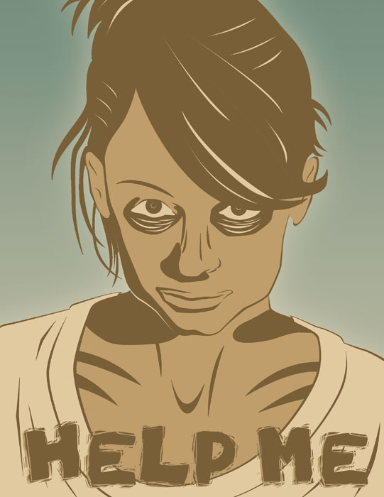
This is my entry for Illustration Friday's "Help" topic. My inspiration was Nicole Richie's recent turn of events, which is a clear cry for HELP. Portrait-type illustration is NOT my specialty, as I have done very little of it. So this was welcome practice. Your feedback is always appreciated!!! Compliments are nice, but anything truly constructive will make me a better illustrator, which is my goal! This was created FRESH for the IF challenge.
The first image is basically my Freehand drawing, but colored in Photoshop.
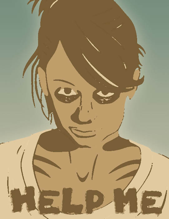
The second two are variations using Photoshop filters.
And the last one is the inspiration photo from The Smoking Gun web site.
Been totally swamped the last few weeks, so I'm behind on things!
posted by Digital Scott's Illustrationblog at 11:19 PM
![]()
![]()

35 Comments:
I love the image, I like the first one the best.
Sorry i dont have anything constructive to say, I just like it thats all.
Not bad! I like them both. The woman really needs help! Anyway, if you want some more practice, there are quite nice and useful tutorials to do, for example: http://www.ndesign-studio.com/resources/tutorials/
Your might illo is also a great one! I didn't see it before. Lovely colors!
I like your portraits, most the first one. I think, in the darkest one, with the black, there's too big contrasts, and in the second there is small inexactitudes, which disturbs the image a little.
Your image interpretes the photo in an expressive way - I think it's great.
i like the stylization of the face you did.. it gives that "third world starving child" look.
personally i think the third one really gets that point across.. it is disturbing like georg said, but that just emphasizes the point.
as for constructive comments.. stylization is fine for something like this, but if you plan on doing a lot of portraits i'd recommend taking anatomy classes, and/or life drawing. having a solid understanding of bone and muscle structure is always helpful.
side note: thank you very much for the comment and your prayers. they are greatly appreciated.
the answer to your question is: yes i did.
happy holidays, buddy!
my prayers go with you too
In your face "help", very dramatic, very compelling, and I love the process as well.
The likeness is fab and the "HELP" written across her chest really drives the point home.
Big WOW!
Hi Scott...they're all very good. Yours reminds me of a lino cut which I find hard to do. I like the drama in your drawing a lot! The others are compelling as well. As far as I can see from all of your blogs, you are continually growing as an artist!
Thanks for all of your nice comments. Happy Holidays!
I had a hunchit was Nicole. She looks good and scary (very "Thriller" video-like) in the first frame. You are bold to take on caricatures...I find them very challenging. Nice job!
VERY NICE!!! as for your question..I don't know why small things are automatically cute but I guess almost all large things are scary huh.. like godzilla
I can't really critique this, it is very well done and really drives home the point! Visually I love the 2nd onebecauses of the colours but probably the 3rd one has more scary impact!
Aside: Topanga is between Malibu and Santa Monica it is considered the Santa Monica Moutains. I love Ventura it is a very quaint old fashioned little town. Of course I love all the old homes there!
quite interesting techique! Powerful image.
great work scott!
Oh boy, you nailed this one, Scott. Great take on the subject and a timely warning as well. The subtle technique works so well with the color palette you chose.
top one great lookin graphic piece
Neat work! It's very subjective, of course, but right now I think my favorite is the third one ...(or the one just above the actual photograph.)I appreciate the striking contrast of color and drama of the image.
Here's a vote for the top one...the 'dark one' has a cartoon zombie comic book feel...the muted colors on the top one tends to humanize the person a bit more...
Hi Scott,
I like your attitude toward those who "behave badly". So many Christians from the "Church of the Sourpuss" are tainted with disdain for others. It's great for you to see beyond Nicole's behavior and into her heart, and perceive her cry for help.
I like the FreeHand illustration at the top.
I'll answer your other questions by posting to my blog...
Ciao,
Roberto
I think the last one is the most dramatic, but I like the colors on the first one, maybe a bit darker brown, I think your overall technique is stellar. Portraiture is something I cannot do at all (things get exagerrated on their own, I can't help it)! Bravo!
Can't make up my mind 'tween the 2nd and 3rd ones. The circles under the eyes seem a little heavy-handed to me (maybe too 'zombie', as someone above noted), but they're valid for stressing emptiness, I guess. I like the color choices, which maybe has me leaning toward the 2nd over the 3rd.
By the way, I didn't recognize Nicole in the mugshot photo. It's not the 'glam' shots you see glaring at you while waiting in the checkout line at the market. Much more attractive here (even though the circumstances were sad).
I think my favorite is the very first. I like the linework.
I could tell it was her right away - The line work in the top is very dramatic and fantastic - it really drives the point home (no pun intended)
Thanks for visiting ElizaDeath!
Nice work! I like the top illo best as it shows a really good line sensitivity and use of shape. The palette is also very good. Reminds me of lino cut work. Hmmm...you nailed the subject matter. Nicole Ritchie's eyes scream "help me"!
Can't make up my mind 'tween the 2nd and 3rd ones. The circles under the eyes seem a little heavy-handed to me (maybe too 'zombie', as someone above noted), but they're valid for stressing emptiness, I guess. I like the color choices, which maybe has me leaning toward the 2nd over the 3rd.
By the way, I didn't recognize Nicole in the mugshot photo. It's not the 'glam' shots you see glaring at you while waiting in the checkout line at the market. Much more attractive here (even though the circumstances were sad).
Oh, man... sorry about the double comment... the one I tried to send this a.m. never showed, I thought.... kept saying 'waiting for blogger'... so I made a copy of what I was trying to send and resent this afternoon... and THEN I saw that the first one was there all the time... sorry.
I always look forward to your posts. Beautiful renderings, as usual.
They're all poignant and compelling!
wow scott at 1st glance i thought the photo was digitaly altered, then i read your comments. you have a good eye for sure. I like the 3rd one best its dramatic and makes a stong point. i like your technique
Wicked! They seem to get more sinister with each one.
Wow, that's deep
GREAT illos, Scott! - they are wonderful - Congrats!!!
That's very unique and dramatic :) Very good effect.
Anyway, i hope I'm not too late in wishing you a blessed Christmas :) Hope you've had a great time with your loved ones yesterday!
este es un nuevo blg de ilustraciones, collage y bocetos.
visitalo y deja un comentario, si te de ganas
gracias
I like the poster look you got here. The colors give it a nice look. Happy new year Scott.
great job here!
this is GREAT! I LOVED
hey bro. nice work. i like so much the first one. the color scheme, great, easy to make it in silk screen, but maybe with a darker brown. not as black as the third one..
Post a Comment
<< Home