Illustration Friday-80s


Click image for a larger view.
This is my entry for IF's topic "80s". And yes, I dropped the apostrophe to be grammatically correct. Only use the apostrophe here if 80s would be possessive. It's a common mistake, sort of like misspelling apostrophe, which I did...
Anyway, I was just at Macworld in San Francisco. It was very fun. My client, lynda.com, had a booth there so I worked at the booth. It was a great experience, but very exhausting to stand all day for a week talking to customers for the entire time. I talked more in one day than I usually do in an entire week. Lynda has really great training for things like Photoshop, Painter, Illustrator and much more. Check it out! You can have access to the entire online library for only $25 per month, with no contract! Even if you've been using Photoshop your whole life, you'll learn even more! See http://www.lynda.com
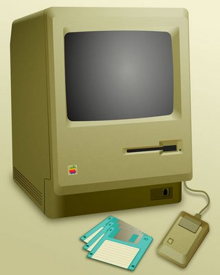
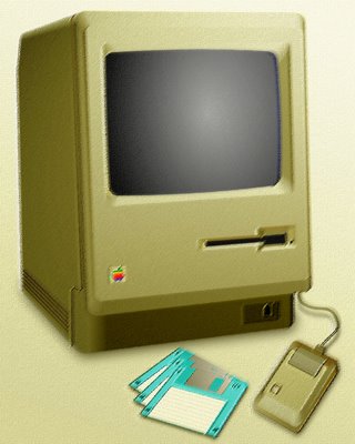
The first Mac was sold in 1984, so this was a likely choice for me. I created this illustration today, Sunday, specifically for the challenge. I drew everything in Freehand, including colors and shading, except for the drop shadows. I then brought it into Photoshop for just a little tweaking. The first one is my original drawing, then I posted a couple variations using filters.
Your feedback is welcome and encouraged.


25 Comments:
My brother in law has a mac museum. He'd be proud of you.
I saw one of these at the thrift store the other day. I really wanted it. :)
Great illustration! Lighting and mood is perfect, and the floppies are a nice touch. :)
Cheers,
Jillian s.
Thought about the Mac Classic, too. The woman I was dating in 1984 bought one of these, and I thought it was cool. How far we've come in two decades! Never thought then that I'd be spending 80% of my work day on a desktop computer. Great technical illustration. I like the filtered versions, but I prefer the original (top one).
Wonderful illustration. This is the one that started it all. I've never used a Mac other than play around at CompUSA. Love the look of OSX, though. I remember when the mac first came out, there was no command line or programming interface (like Commodore 64 or Atari 400/800) and I wondered how do you use it. The idea, at the time, of point and click was so foreign.
I just upgraded my Paint Shop Pro 8 to PSP XI. The upgrade comes with 2 hours of lynda.com training for Paint Shop Pro.
Haha I love that. It reminds me of the computers that we had in school. Oh that was a fun time.
Great work!!!
I bought a Mac Classic in a Good Will store for 5 bucks. It looked so cool I had to buy it. I saw online where someone turned one into a Macquarium... with fish in it. Good job on the rendering!
Oh yes! Yes, yes, yes! I experience an almost religious euphoria when I think of the Mac. The command line that Larry speaks of is exactly the reason I WASN'T interested in computing before 1984. Then came the Mac and I found out why 1984 wasn't going to be like 1984.
Your technical precision on these illustrations is unmatched.
Nice technique, but if you are going to be critical of the use of the apostrophe in your blog you might have taken the trouble to spell the word correctly?
yey mac! great work.
Ouch! Yes I did misspell apostrophe! But I fixed it. Thanks!
Sorry it came across a little more abrupt than I meant- I don't think I have yet posted a blog without a spelling mistake! Just ironic that you chose that sentence to get wrong.
No offense taken! I'm glad to be aware of the error. When I typed it, I sensed it was wrong, I was just too tired to look it up... Of course it had to be in the sentence where I'm trying to sound like I know what I'm talking about! I deserved it!
Looks so photo realistic. Very nice. Reminds me of my childhood with my first Mac. By the way, Lynda rocks! About 7 years ago I got one of her books when I first got into web design.:)
Cool! Very photo realistic indeed! Cool.
Oh wow this was my first Mac. I had it until 1995 when I traded it in for a Performa. Then came the first Tower, then my second tower (g4), and now my latest, the iMac. So funny to think of the evolution!
Great illustration! I remember my first mac...1994...I had ordered it...said it would take 4 weeks to deliver it (top of the line)...by the time I got it they informed me that had dropped that model's line...but I stuck with em as the superior machine...also of note from a book a friend showed me several years ago...(remember the lawsuit between mac and windows for the operating system)...well it turned out the suit was dropped in part because Apple had swiped the GUI idea from XEROX when SJ (if I recall correctly)visited a special area they had developing 'dream computers' they never intended to produce...
Now I'm wondering “did I put the apostrophe in 80s?”
I like the first version without the filters the most. Great looking Mac. I still have some of the old rainbow Apple logo stickers.
hey! I remember 'learning' on this computer in grade 2. our school only had two of them, and they were in the hallway. we had to share...Anyways, enough of my crappy reminiscing - great illustration! i like the slightly fuzzy quality about them...
This is really clever and beautifully done! I wish I could do this! I like when you show how you create your art. Sounds like a cool company to work with!
Excellent digital illustration. I'm envious! I had a Mac Plus (actully still do, but it doesn't work) and I can't bring myself to trash it. I like your other 80s illo, too.
I look at your freehand and wonder, could I do something so beautiful in its perfection-I'm still wondering, but I think it doubtful I could. The subtle differences in the three make this work all the more interesting, and I find your narrative informative and absorbing reading as usual.
Wonderful!
I remember when they came out! We got one at work immediately. I started using MacDraft and the original Aldus art products! I bought one myself and it still works, but is in the attic.
Extremely well done. I could never produce what you did. Your abilities are amazing!
I like the top on the best... it seems we've come a long way from this machine to the current iMacs.
So cute!
That's a nice illo, the 80s for sure, I miss those days and the old apple
Post a Comment
<< Home