Illustration Friday-Buzz

Click image for larger view.
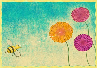
This is my entry for Illustration Friday's topic "buzz". I created this today, specifically for the challenge. I want to continue to experiment with styles and take chances and learn and grow. That's what I'm here for.
I'm in San Francisco for the Macworld convention next week and have a few days here early to wander around this beautiful and interesting town. I found a great deal on a hotel on the web and it's in a great location. There are tons of art galleries within a few blocks of here. It was very fun to browse some of them today. There's a lot of great art in this town!
*****Update: I've posted some SF pics here: http://mynewphotoblog.blogspot.com/
So anyway, I wanted to do something with a more "natural media" feel to it. But not being at home, all I have is my trusty Mac and a mouse. No paper, paint, scanner, etc.
So this is my entry. As I often do, I drew the shapes and original composition in Freehand and then colored and textured in Photoshop. In upcoming weeks, I hope to incorporate more natural media.
I was not excited about last week's topic, but it was mostly due to being incredibly worn out from a very, very busy stretch of about 7 weeks, and it showed!
As for Macworld, I've never been to it, so it will be interesting to see what it's all about.
Please let me know what you think about my illustration! Help me grow!
Regards,
Scott


33 Comments:
wow, very pretty! nice texture, and color palette. :)
i like it! beautiful in its simplicity.
its a very cool image - has a great feel to it
Thanks for your comments, much appreciated
Check out http://blankenstineunmasked.blogspot.com/
for very useful illustration methods
I wasn't feeling last weeks topic either.
You coloured this in in Photoshop? You did a really good job at making it look like traditional media.
Very nice.
Hehehehe... I think the bee knows better than me where finding what she needs ;)
Hi
Nice use of repeating patterns. I like it. Soothing.
On the crit side, the lines could be heavier or more beveled in places on the bee and he could be bigger to give a sense of perspective. The image looks a bit flat without the perspective element.
Not taking away from the work at all. It's a good illustration, especially for something done with a mouse.
Cheers
Tom
love the flowers!
great job! love the colors! Have fun in SF!
Actually I'm a little surprised that this is done on computer, I thought you painted or used pastels! I really do paint everything by hand so when you say Freehand I thought you mean freehand. But, duh it's a program? I'm behind the times...
Have a wonderful time in SF Scott, and maybe I'll see you in the Bu sometime! (Malibu)
Hi! Really I like the illustration, Funny!
Happy 2007!
Robert Vandenbego
Madrid, Spain
www.begomadrid.blogspot.com
haha! this is too cute! the background color is just enough to set the scene and the flowers are quite unique. all in all, quite a terrific job!
Cheers,
Theresa
Really like the background...it reminds me of sponged watercolor on natural paper...except for the 'perfection' of the pattern in the flowers it looks very much like it was done with traditional media...nice....
nice technique and colors
hey, Scott... Macs RULE! I wish I could attend a Macworld convention. I have visited San Fran in the past... a great city. Hope you have a great time there... Oh, nice illo. I like that texture you created.
Wow! You sure are showing quite a range of styles. Great job! Your bee really has his eye on the prize :)
very cools cott! great work!
I like the very delicate use of digital media that you got here, well done!
Tnx for your comment...
ah, very nice! love the soft color choice and the composition. More, Please!
I like it when a picture can take me somewhere, this is a warm and gentle trip to springtime. I found myself a little lost in it. Simple lines and colors with the fine detail in the flowers-beautiful, I can just hear the little bees buzz.
I enjoyed your SF photos.
You wondered in your comment if I lived near the PCH. I lived in Irvine for a few years, not too long ago. Thanks for your comment by the way.
Those flowers are hypnotic! Great composition and colors. Enjoy San Francisco!
hey digital scott, nice bee. i clicked on the image to see a larger picture and i like the textures you used
i like the background-it's like you have used pastels-i have been trying to get this kind of effect in my digital drawings actually . the bee is actually beautiful. the light orange flower looks like painted in pastel, too but the two other ones because of their desings looks really digital.
i use mouse a lot that is why i have carpal tunnel but i wanted to be comfortable with my tablet.
I like this a lot! The dotted line ties all together perfectly.
That's adorable. We all love our food. At least I do.
love those wild flowers!
Great textures on this one.
Nice illo. I like the Illo friday "might" one too.
I really like it! Great textures and colours.
Your bee is goal oriented and focused. I see a bulls-eye in his immediate future. Keep having fun with your art Scott.
You got some great textures out of your Photoshop there... Really nice. Checked out your SF photos. Wonderful shots of a great city. It's always interesting visiting that place.
Thanks for the comments on my post, and, no, the story is not autobiographical. My marriage is buzzing along nicely, thank you.
Nice work! :-D
That is a very cool illustration. I love the b-line. Great concept and textures.
Post a Comment
<< Home