Thursday, September 27, 2007
About Me

- Name: Digital Scott's Illustrationblog
- Location: Ventura, California, United States
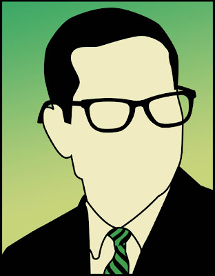
I am an illustrator and graphic designer. I design and build web sites. I am a volunteer naturalist and spend time whale watching. I don't wear glasses. I don't have short hair. I hate wearing ties. And I'm not that good looking.


16 Comments:
Nice work! I love the sort of antiqued look it's got and the line quality is beautiful. I think I like the one with the lettering more.
One thing: the right arm looks like it's at an impossible angle if it's one person juggling, don't know if that was intentional or not (maybe the arms are being juggled too)
i agree with carol about the arms if it is one person doing the juggling, and i like the pic with the copy best sorta holds it all together
Nice! But this week's theme is the Blues, right?
i love it scott and i just held my arms in the position and it's totally right? It's an optical illusion... Great work! ~valgalart
I really love this. I love the textues and colors really work! And I like both.
It's a toss up, I like them both very much! ;) Nice work with the veggies and text.
I like the text. It's a great play on words. This definitely works.
I like the one with the text. It looks like an ad for a grocery. It's cool!
The texture adds a nice, organic look to it. Nice use of color.
Wow! Great illos, Scott! I love the 2nd one the best!
good job, I think the text adds more to it and completes the visual pun.
I also really like the look of the cheese one (yum, cheeeeese....) and the text makes them both match.
the textures and type add character to an otherwise digital-looking image.
Fantastic, Scott!
Very snazzy images texture and line quality.
If you're going to have it with "The Blues" I like the text. Great color and design...makes me hungry.
The piece with the lettering I'm liking better-has a vintage feel, I like the action and the flavors. Yum!
I will join in the chorus with "the one with the text looks best". I dig your muted color choices and textures. You also have a good eye for unique compositions. Nicely done.
Post a Comment
<< Home